
Slideshow
A set of slides shoppers can move through. Each slide has its own image or video and content.
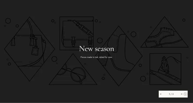
To add it, select Add section in the theme editor and choose Slideshow.
Section settings
Section titled “Section settings”Media height
Section titled “Media height”| Setting | Details |
|---|---|
| Height on desktop | “Adapt to media” sizes each slide to its own media; the tallest slide sets the height. Options: Adapt to media, Adapt to first media, Fixed height, Fill screen (default). |
| Height | 300–1200px, default 700px. |
| Height on mobile | Options: Adapt to media, Adapt to first media, Fixed height (default), Fill screen. |
| Height on mobile | 300–900px, default 600px. |
| Overlay opacity | 0–80%, default 20%. |
Slider controls
Section titled “Slider controls”| Setting | Details |
|---|---|
| Transition | Options: Slide, Parallax (default), Curtain. |
| Controls | Options: Arrows with counter (default), Next slide preview, Arrows and dots. |
| Position | Options: Bottom right (default), Bottom left. |
| Autoplay | Default: on. |
| Change every | 3–10s, default 6s. |
Layout
Section titled “Layout”| Setting | Details |
|---|---|
| Section width | Options: Page, Full width (default). |
| Margin top | 0–200px, default 0px. |
| Margin bottom | 0–200px, default 0px. |
| Margin top mobile | 0–120px, default 0px. |
| Margin bottom mobile | 0–120px, default 0px. |
Colors
Section titled “Colors”| Setting | Details |
|---|---|
| Color scheme | Colors of the slider controls. Each slide’s content can use its own scheme. |
Blocks
Section titled “Blocks”Can contain: Content.
| Setting | Details |
|---|---|
| Media | Options: Image (default), Video. |
| Image | |
| Mobile image | Used on screens under 750px. Leave empty to use the desktop media. |
| Video source | Options: Shopify-hosted (default), YouTube or Vimeo. |
| Video | |
| Mobile video | Used on screens under 750px. Leave empty to use the desktop media. |
| Video URL | YouTube or Vimeo link. |
| Poster image | Shown while the video loads, and when visitors prefer reduced motion. Defaults to the video preview image. |
This section also uses these shared blocks: Content, Subheading, Heading, Text, Buttons, Button.