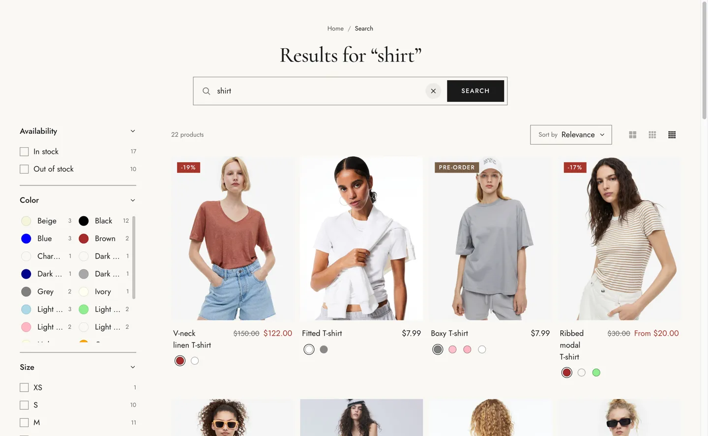
The search results page.
| Setting |
Details |
| Show articles and pages |
Default: on. |
| Filter layout |
Mobile always uses the drawer. Options: Sidebar (default), Drawer. |
| Enable filtering |
Customize filters with the Search & Discovery app. Default: on. |
| Enable sorting |
Default: on. |
| Setting |
Details |
| Products per page |
8–48, default 24. |
| Columns on desktop |
2–4, default 4. |
| Columns on mobile |
Options: 1, 2 (default). |
| Show grid view switch |
Default: on. |
| Setting |
Details |
| Section width |
Options: Page (default), Full width. |
| Padding top |
0–200px, default 48px. |
| Padding bottom |
0–200px, default 80px. |
| Padding top mobile |
0–120px, default 32px. |
| Padding bottom mobile |
0–120px, default 48px. |
| Setting |
Details |
| Color scheme |
|
| Background |
Options: None (default), Image, Video. |
| Image |
Also used as the video poster and fallback. Tablet spacing is the average of desktop and mobile. |
| Video |
|
| Overlay opacity |
Tints the image or video with the color scheme background, so the text stays readable. 0–90%, default 0%. |
This section also uses these shared blocks: Product card.
