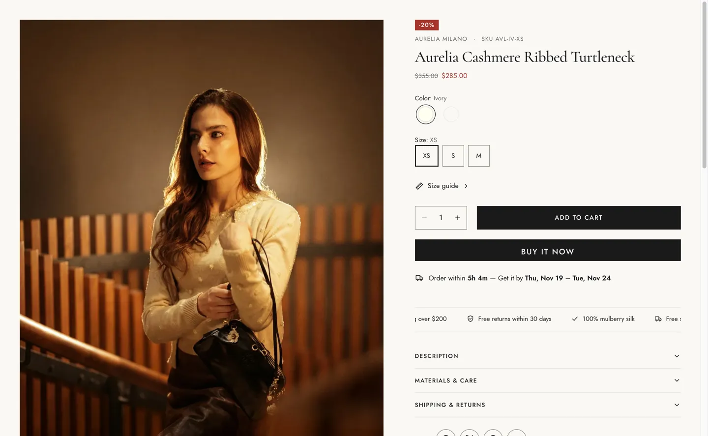
The main section of a product page: the media gallery and the product information blocks.
| Setting |
Details |
| Sticky product info on desktop |
Default: on. |
| Setting |
Details |
| Layout |
Options: Grid (default), Stack, Slider. |
| Thumbnails |
Options: Left (default), Bottom, None. |
| Show first media full width |
Default: on. |
| Media width |
40–65%, default 55%. |
| Media ratio |
Options: Adapt to image (default), Portrait (3:4), Square (1:1). |
| Open images in lightbox |
Default: on. |
| Setting |
Details |
| Show sticky add to cart |
Default: on. |
| Show on mobile |
Default: on. |
| Setting |
Details |
| Section width |
Options: Page (default), Full width. |
| Padding top |
0–200px, default 80px. |
| Padding bottom |
0–200px, default 80px. |
| Padding top mobile |
0–120px, default 48px. |
| Padding bottom mobile |
0–120px, default 48px. |
| Setting |
Details |
| Color scheme |
|
| Background |
Options: None (default), Image, Video. |
| Image |
Also used as the video poster and fallback. Tablet spacing is the average of desktop and mobile. |
| Video |
|
| Overlay opacity |
Tints the image or video with the color scheme background, so the text stays readable. 0–90%, default 0%. |
This section uses these blocks: Badges, Title, Price, Variant picker, Buy buttons, Marquee, Pickup availability, Back in stock form, Accordion, Product recommendations, Vendor and SKU, Description, Drawer link, Estimated delivery, Trust image, Share, Message, Row.
