An image with hotspots. Each hotspot opens a product shown in the image.
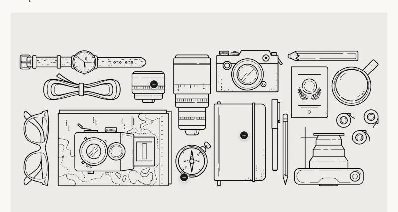
To add it, select Add section in the theme editor and choose Shop the look.
| Setting |
Details |
| Image |
|
| Mobile image |
Used on screens under 750px. Leave empty to use the desktop media. |
| Image ratio |
Options: Adapt to image (default), Portrait (3:4), Square (1:1), Landscape (4:3). |
| Hotspot style |
Options: Number, Plus (default). |
| Setting |
Details |
| Section width |
Options: Page (default), Full width. |
| Padding top |
0–200px, default 100px. |
| Padding bottom |
0–200px, default 100px. |
| Padding top mobile |
0–120px, default 56px. |
| Padding bottom mobile |
0–120px, default 56px. |
| Setting |
Details |
| Color scheme |
|
| Background |
Options: None (default), Image, Video. |
| Image |
Also used as the video poster and fallback. Tablet spacing is the average of desktop and mobile. |
| Video |
|
| Overlay opacity |
Tints the image or video with the color scheme background, so the text stays readable. 0–90%, default 0%. |
| Setting |
Details |
| Content |
Options: Product (default), Text. |
| Product |
|
| Heading |
Default: “Hand-finished seams”. |
| Text |
Default: “Every seam is pressed and closed by hand.”. |
| Setting |
Details |
| Horizontal position |
0–100%, default 50%. |
| Vertical position |
0–100%, default 50%. |
| Different position on mobile |
Default: off. |
| Horizontal position on mobile |
0–100%, default 50%. |
| Vertical position on mobile |
0–100%, default 50%. |
This section also uses these shared blocks: Section heading.
