
Banner with products
A banner beside a column of products.
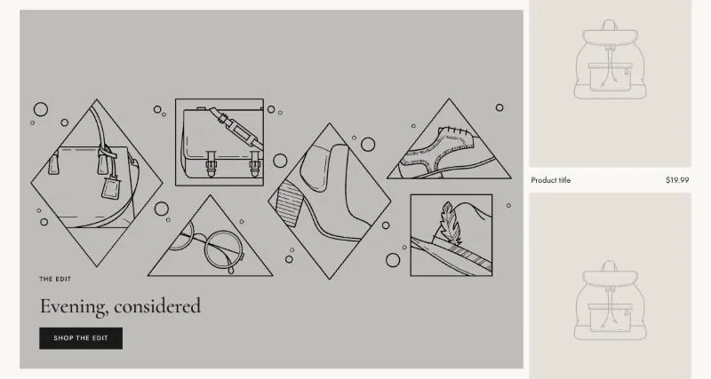
To add it, select Add section in the theme editor and choose Banner with products.
Section settings
Section titled “Section settings”| Setting | Details |
|---|---|
| Media | Options: Image (default), Video. |
| Image | |
| Mobile image | Used on screens under 750px. Leave empty to use the desktop media. |
| Video source | Options: Shopify-hosted (default), YouTube or Vimeo. |
| Video | |
| Mobile video | Used on screens under 750px. Leave empty to use the desktop media. |
| Video URL | YouTube or Vimeo link. |
| Poster image | Shown while the video loads, and when visitors prefer reduced motion. Defaults to the video preview image. |
| Play button position | Without a play button, visitors can’t pause the video. Keep one when the video plays longer than 5 seconds (accessibility). Options: None, Top left, Top right, Bottom left, Bottom right (default). |
| Overlay opacity | 0–80%, default 20%. |
Products
Section titled “Products”| Setting | Details |
|---|---|
| Collection | |
| Products | List of products. Overrides the collection when products are selected. |
| Products to show | 2–12, default 4. |
| Card width on mobile | 50% shows two whole cards, 100% shows one. 50–100%, default 70%. |
Layout
Section titled “Layout”| Setting | Details |
|---|---|
| Product layout | List keeps the banner in view while one column of products scrolls (desktop). Options: List (sticky banner) (default), Grid (2 columns). |
| Media position | Options: Left (default), Right. |
| Media width | Options: Medium (50%), Two thirds, Three quarters (default). |
| Section width | Options: Page (default), Full width. |
| Padding top | 0–200px, default 100px. |
| Padding bottom | 0–200px, default 100px. |
| Padding top mobile | 0–120px, default 56px. |
| Padding bottom mobile | 0–120px, default 56px. |
Background
Section titled “Background”| Setting | Details |
|---|---|
| Color scheme | |
| Background | Options: None (default), Image, Video. |
| Image | Also used as the video poster and fallback. Tablet spacing is the average of desktop and mobile. |
| Video | |
| Overlay opacity | Tints the image or video with the color scheme background, so the text stays readable. 0–90%, default 0%. |
Blocks
Section titled “Blocks”This section also uses these shared blocks: Content, Product card, Subheading, Heading, Text, Buttons, Button.