Links to your collections, shown as a grid, a slider or a list.
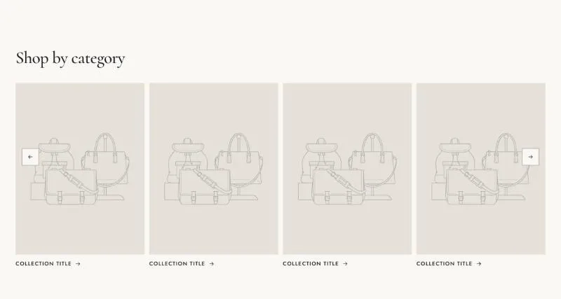
To add it, select Add section in the theme editor and choose Collection list.
| Setting |
Details |
| Layout |
Options: Grid, Slider (default), List. |
| Card style |
Options: Title below image (default), Title on image, Circle. |
| Image ratio |
Options: Portrait (3:4) (default), Square (1:1), Landscape (4:3). |
| Columns on desktop |
2–6, default 4. |
| Columns on mobile |
Options: 1, 2 (default). |
| Show product count |
Default: on. |
| Show image on hover |
The collection image follows the pointer on desktop. Default: on. |
| Setting |
Details |
| Show arrows |
Default: on. |
| Arrow style |
Options: Outline (default), Solid, Minimal. |
| Show dots |
Default: off. |
| Dots style |
Options: Line (default), Dot, Number and bar. |
| Setting |
Details |
| Show view all |
Links to the page listing all collections. Default: off. |
| View all label |
|
| Setting |
Details |
| Section width |
Options: Page (default), Full width. |
| Padding top |
0–200px, default 80px. |
| Padding bottom |
0–200px, default 80px. |
| Padding top mobile |
0–120px, default 48px. |
| Padding bottom mobile |
0–120px, default 48px. |
| Setting |
Details |
| Color scheme |
|
| Background |
Options: None (default), Image, Video. |
| Image |
Also used as the video poster and fallback. Tablet spacing is the average of desktop and mobile. |
| Video |
|
| Overlay opacity |
Tints the image or video with the color scheme background, so the text stays readable. 0–90%, default 0%. |
| Setting |
Details |
| Collection |
|
| Image |
Defaults to the collection image. |
| Heading |
Defaults to the collection title. |
This section also uses these shared blocks: Section heading.
