A row of logos, for example brands you stock or press mentions.
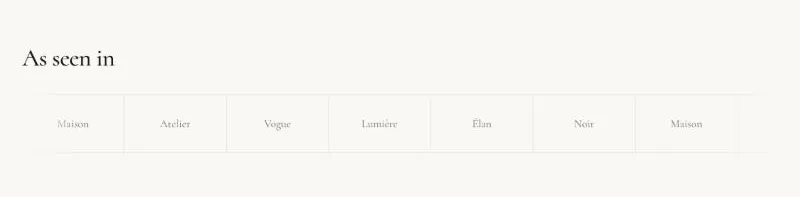
To add it, select Add section in the theme editor and choose Logo list.
| Setting |
Details |
| Layout |
Options: Marquee (default), Grid. |
| Columns on desktop |
3–8, default 6. |
| Columns on mobile |
Options: 2 (default), 3. |
| Loop duration |
Time for one full loop. Higher is slower. 10–120s, default 30s. |
| Direction |
Options: Left (default), Right. |
| Setting |
Details |
| Logo height |
Mobile uses 75% of this height. 20–120px, default 40px. |
| Logo width |
Options: Auto (fit each logo), Equal (default). |
| Padding |
8–80px, default 32px. |
| Border |
Default: on. |
| Logo color |
Monochrome shows logos in grayscale until hovered. Options: Original (default), Monochrome. |
| Setting |
Details |
| Section width |
Options: Page (default), Full width. |
| Padding top |
0–200px, default 80px. |
| Padding bottom |
0–200px, default 80px. |
| Padding top mobile |
0–120px, default 48px. |
| Padding bottom mobile |
0–120px, default 48px. |
| Setting |
Details |
| Color scheme |
|
| Background |
Options: None (default), Image, Video. |
| Image |
Also used as the video poster and fallback. Tablet spacing is the average of desktop and mobile. |
| Video |
|
| Overlay opacity |
Tints the image or video with the color scheme background, so the text stays readable. 0–90%, default 0%. |
| Setting |
Details |
| Image |
|
| Brand name |
Used as the alt text and shown while no image is set. |
| Link |
|
This section also uses these shared blocks: Section heading.
