A large image or video banner with a heading, text and buttons. It is usually the first section on the home page.
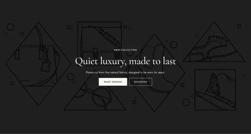
To add it, select Add section in the theme editor and choose Hero.
| Setting |
Details |
| Media |
Options: Image (default), Video. |
| Image |
|
| Mobile image |
Used on screens under 750px. Leave empty to use the desktop media. |
| Video source |
Options: Shopify-hosted (default), YouTube or Vimeo. |
| Video |
|
| Mobile video |
Used on screens under 750px. Leave empty to use the desktop media. |
| Video URL |
YouTube or Vimeo link. |
| Poster image |
Shown while the video loads, and when visitors prefer reduced motion. Defaults to the video preview image. |
| Play button position |
Without a play button, visitors can’t pause the video. Keep one when the video plays longer than 5 seconds (accessibility). Options: None, Top left, Top right, Bottom left, Bottom right (default). |
| Overlay opacity |
0–80%, default 20%. |
| Show scroll down button |
Default: off. |
| Setting |
Details |
| Height on desktop |
Options: Adapt to media, Fixed height, Fill screen (default). |
| Height |
300–1200px, default 700px. |
| Height on mobile |
Options: Adapt to media, Fixed height (default), Fill screen. |
| Height on mobile |
300–900px, default 560px. |
| Setting |
Details |
| Top and bottom spacing |
0–160px, default 64px. |
| Side spacing |
Content never comes closer to the edge than the page margin, and lines up with the page width on wide screens. 0–160px, default 48px. |
| Top and bottom spacing on mobile |
0–120px, default 40px. |
| Side spacing on mobile |
0–80px, default 20px. |
| Setting |
Details |
| Section width |
Options: Page, Full width (default). |
| Margin top |
0–200px, default 0px. |
| Margin bottom |
0–200px, default 0px. |
| Margin top mobile |
0–120px, default 0px. |
| Margin bottom mobile |
0–120px, default 0px. |
| Setting |
Details |
| Color scheme |
|
This section also uses these shared blocks: Content, Subheading, Heading, Text, Buttons, Button.
