
Scrolling gallery
Text beside columns of images that scroll as the shopper moves down the page.
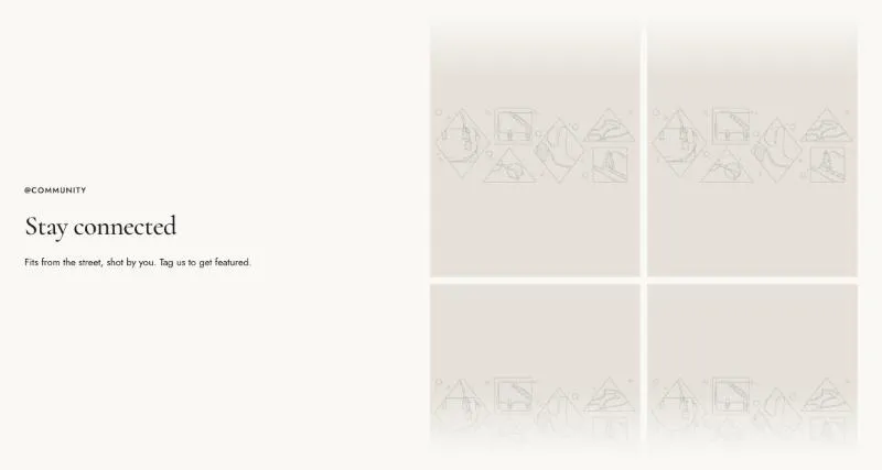
To add it, select Add section in the theme editor and choose Scrolling gallery.
Section settings
Section titled “Section settings”| Setting | Details |
|---|---|
| Media position | Options: Left, Right (default). |
| Columns on desktop | Options: 2 (default), 3. |
| Speed | Pixels per second. 10–100px, default 40px. |
| Height | Height of the image columns on desktop. 400–1000px, default 720px. |
Layout
Section titled “Layout”| Setting | Details |
|---|---|
| Section width | Options: Page (default), Full width. |
| Padding top | 0–200px, default 120px. |
| Padding bottom | 0–200px, default 120px. |
| Padding top mobile | 0–120px, default 64px. |
| Padding bottom mobile | 0–120px, default 64px. |
Background
Section titled “Background”| Setting | Details |
|---|---|
| Color scheme | |
| Background | Options: None (default), Image, Video. |
| Image | Also used as the video poster and fallback. Tablet spacing is the average of desktop and mobile. |
| Video | |
| Overlay opacity | Tints the image or video with the color scheme background, so the text stays readable. 0–90%, default 0%. |
Blocks
Section titled “Blocks”Images
Section titled “Images”Can contain: Images, Image.
Images are shared out across the columns in turn.
| Setting | Details |
|---|---|
| Image | |
| Link |
This section also uses these shared blocks: Subheading, Heading, Text, Social media, Buttons, Button.